Below is our first attempt at looking at planning our film opening. From the research done, we planned out our inspiration and ideas promoted by the research.
We thought about including a flashback to something that has happened in the past to link to the current time later on in the opening. To show that it's a flashback we thought that when it came to editing the clip, we could change the appearance of the picture by showing it in a sepia/ old style look to it. Also the sound could be faded by being made quieter and echo more. Mise-en-scene would be a big factor for a flashback as if it was a flashback to the early 1900's, then clothing of any characters used would have to be war style and the area around them would have to look like it's from that time, otherwise it could be confusing if there's a car in the background or something of the sort.
From looking at research we found out that sound affects and how they're used is very important as they create suspense in many ways for the horror genre. Even sounds such as footsteps create suspense as it depends on the pace of them and if they're exaggerated (eg. echoing, gradually getting louder etc). For example, if the footsteps are fast pace then this can create suspense as questions may be asked such as, why are they rushing? Who is it that's rushing? Has something bad happened? Are they going to or from an accident? Etc. Or if the footsteps are stepping slowly, this can make the viewer want to see who the owner of the footsteps belong to and the more the sound is prolonged, the more the viewer is kept in suspense. However if the footsteps go on too long, it can get boring to watch.
The location of the film opening is very important as it needs to be realistic such as a graveyard, a park, a house etc. This is so the viewer can relate to the film as the majority of people have been to a graveyard and place like this. We thought about using a graveyard as these are stereotypical shown as being haunted places where spirits of the dead come alive which links in nicely to our theme.
With all these factors in mind we developed our ideas making sure it was possible.
This was when we came up with the idea of a doll. We wanted to make our film more mysterious so we all liked this idea very much.
As we decided that we were going to use a doll, we thought that dolls are usually associated with young girls. With this in mind we also thought of names that may go with this nicely.
Thursday, 31 January 2013
Horror Movie Research - P2 (2007) - By Chelsea Neil
P2 (2007)
The
beginning of the film immediately starts in a highly dark contrasted
and gloomy atmosphere, the camera shot slowly goes downwards on what looks to
be like a pillar. The soundtrack almost compliments the camera shot - The
way the song is very slow and gentle, yet happy contrasts with the dark and
gloomy atmosphere, it seems as if the whole beginning is trying to mess
with your mind.
I like
how each of the camera shots run smoothly into another, not only this, but
the fact the film title 'P2' is written on the wall makes the wonder what this
place has to do with the whole film in itself.
The
camera slowly moves round, giving an establishing shot of the whole atmosphere,
it slowly moves around and then stops as if it is focusing on a particular
thing in the room - It slowly opens up the audience to the main centre of the
film.
I like
how the camera shot goes from a small hole on the car boot and builds up to an
eye peering out - Why is there a person looking out?
The music
ultimately creates the whole camera shot - The person inside the boot begins to
scream, the happy Christmas music then slows down and cuts out.
Ideas
From this
film opening I have definitely taken a few ideas I may want to use in
my actual film opening - The way the dark scenery and the contrasting happy
music makes the film seem even more creepy and builds tension in a completely
unique way, I also like how each shot makes you continuously ask different
questions.
Tuesday, 29 January 2013
Horror Movie Research - The Gravedancers - By Chelsea Neil
The Gravedancers
Analysis
The film
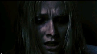
immediately starts with a girl and a light bulb sitting in the corner of the
room, it immediately makes you start asking questions - Does this girl sum
up the entire film? The fact that the room is dark, makes you realise that
something is not quite right.
The
extreme close up of this girl lets you know what she is thinking and feeling,
her face stands out with the darkness of the room. The mise-en scene in
this makes it seem as though the girl is quite dirty, her facial
expression is obviously scared making you wonder what will happen
next.
The way
that the torch is focused on something on the right hand side immediately makes
you wonder what it is, this shot builds tension and makes you want to know
more.
This is
one of my favourite shots - I like how the camera is peering into something
that makes it seem quite fuzzy, this shot give us the fact that
something/someone is watching her.
The
camera shot continuously goes back from herself and then gives an establishing
shot of the atmosphere to build up more and more tension.
The fact
that the screen goes black immediately makes you wonder what will happen next -
It makes the film unique by not having straight edits throughout and adding a
black screen to add effect, this also contrasts with the room as it is a dark
room.
The
camera shots constantly go back to the girl and the torch and her trying to
find what it is that is out there in the darkness, the fact that it keeps going
back to the same shots makes it seem as if time is passing by and she is
constantly trying to find what is awaiting her.
I like
how each shot slowly opens the audience up to the surrounding atmosphere, the
fact that the light is focused on one certain place and you can't quite see the
area around it makes it all the more scary and builds tension.
I like
how there is a repetitiveness of constantly going back to the girls face,
this gets the audience involves and makes the film seem all the more
scary.
I like how this shot makes it seem slightly fuzzy, almost as if
something is interfering with the image we are seeing.
I really like how this shot portrays being scared, the way it focuses on
the main character and what she is feeling makes it more appealing to the
audience.
The dark
shadowy outlines makes you realise that someone is actually in the room with
her, the fact that it doesn't show you the creatures face but rather just
reveals the back of it makes the viewer hooked into the beginning.
This shot is repeated in this film at least three times, it
constantly makes you think that something is watching her and is hiding behind
the darkness.
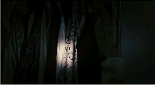
I like the lighting in this particular shot, the way the curtains are
closed and you can see a little bit of lightness contrasts with the darkness of
the room.
I really
like how the lighting is used in this film in order to portray a meaning - For
example, in this shot, the stream of light is only below her nose, but not
above her eyes. Not only this, but for these particular shots there seems to be
a sequence - Surroundings, character, surroundings etc.
I like how all of these three shots run smoothly together - The first
picture is of a close up of her face to the side, the second shot shows more of
her body, then the third shot shoes a close up once again of her facial
expressions.
I like how the tension continuously builds - Not only this, but throughout
the clip, the main character has always blended into the room. The fact that
there is a stream of light behind her suggests that something is awaiting her.
As the
girl is hanging from the rope and falls, there is flashing light surrounding
her, brightening up the atmosphere as she is slowly jolting.
At this
point, the camera is looking directly up at the girl, this makes the audience
ask a lot of different questions - How did she die? Who killed her? What did
she do?
The fact
that the ending shot focuses on an envelope with a light border around it and
darkness in the background makes you wonder what this envelope has to do with
the girl dying.
Friday, 25 January 2013
Horror Movie Research - Return to Sleepaway Camp - By Jodi Lee
Return to Sleepaway Camp
Analysis
Close up of a poster about the camp. It says that it'll be 'A summer
you'll NEVER forget' which can either mean in a good way or a bad way. This
shows that something bad might be happening or has happened in the camp before.
The camera pans down the poster and slowly zooms in on the writing to emphasise
it.
The camera pans across quickly to show other articles about death and
bad things that have happened. This make you think that something bad has
happened and will happen furtehr on in the film. Randomly over the writing is
blood splatters which also adds to the effect of something bad happening.
In the opening the people starring in the film name's are shown and the
producers etc. Also with the blood splatters to carry on the effect.
The camera carrys on moving across the pages showing other stories.
The background then turns red which relates to the blood splatters on
the pages. Red is also associated with danger and death.
The movie title writing then slowly fades on onto the background, this
is also red and blood like which carries on the thought of someone dying or
being killed.
The scene then moves to a slightly tilted to the side view of a house
and it then slowly movoes towards the house. This is shoing that the scene is
likely to be about the huose or that the next scene will be inside the house
next.
The scene then moves to the house/cabin and there are a group of boys
messing around with fire and another boy walks in who seems to think that he is
better than the rest of them.
The boy then threatens the other boys and then he joins in with
what they were doing.
He then gets an aerosol can and sprays that at a flame to create a
massive flame to scare away the other boys.
A man then comes in an pulls the boy away from the other boys and hold
him there. This shows that he is no longer the 'bigger' person in the room.
Subscribe to:
Posts (Atom)


